Graphs and charts are common features in the IELTS Writing Task 1 academic module. They serve as visual aids to convey complex data in a clear and organized manner. Understanding how to interpret and analyze different types of graphs and charts is essential for success in this section of the exam. In this lesson, we will focus on four main categories: line graphs, bar charts, pie charts, and tables. Each type presents unique challenges and requires specific approaches for effective interpretation and description. By the end of this lesson, you will have a solid foundation in analyzing and writing about graphs and charts, empowering you to tackle any related question with confidence.
نمودارها و جداول از ویژگیهای رایج در بخش اول نوشتاری آزمون آکادمیک آیلتس هستند. این نمودارها به عنوان ابزارهای بصری برای انتقال دادههای پیچیده به صورت واضح و منظم عمل میکنند. درک نحوه تفسیر و تحلیل انواع مختلف نمودارها و جداول برای موفقیت در این بخش از آزمون ضروری است. در این درس، ما بر روی چهار دسته اصلی تمرکز خواهیم کرد: نمودارهای خطی، نمودارهای میلهای، نمودارهای دایرهای و جداول. هر نوع نمودار چالشهای منحصر به فردی را ارائه میدهد و نیاز به رویکردهای خاصی برای تفسیر و توصیف مؤثر دارد. در پایان این درس، شما سواد بالایی در تحلیل و نوشتن درباره نمودارها و جداول خواهید داشت و میتوانید با اعتماد به نفس به هر سؤالی در این زمینه پاسخ دهید
Trends and Changes:
These terms describe the direction or pattern in which something is moving or evolving over time.
این دسته از کلمات و عبارات برای توصیف الگوی نمودارها در طی زمان استفاده میشوند
- Trend: A general direction in which something is developing or changing.
- Example: The line graph shows a significant upward trend in smartphone usage from 2010 to 2020.
- Fluctuation: Frequent changes in level, especially up and down.
- Example: There was a noticeable fluctuation in temperature throughout the year.
- Stable: Not changing or fluctuating; steady.
- Example: The data remained stable between March and May.
- Comparison: The act of evaluating two or more things to identify similarities and differences.
- Example: Comparing the two graphs, we see that revenues grew faster than expenses.
- Significant: Large or important enough to be noticed or have an effect.
- Example: There was a significant increase in online sales during the holiday season.
- Slight: Small in degree; not considerable.
- Example: A slight decrease was observed in the fourth quarter.
- Moderate: Average in size or amount; not extreme.
- Example: The bar chart shows a moderate improvement in test scores.
Increases and Decreases:
These terms specify changes in magnitude, either positive or negative.
این دسته اصطلاحات برای توصیف تغییرات مثبت و منفی استفاده میشوند
- Increase: To become larger in number or amount.
- Example: Sales increased steadily over the period.
- Decrease: To become smaller in number or amount.
- Example: There was a sharp decrease in the number of visitors after June.
- Rise: An increase in level or amount.
- Example: There was a gradual rise in the price of oil.
- Fall: A decrease in level or amount.
- Example: A sudden fall in population was recorded after the natural disaster.
- Drop: A sudden decrease in level or amount.
- Example: The bar chart shows a dramatic drop in unemployment rates in 2015.
- Surge: A sudden and large increase.
- Example: There was a surge in demand for electric cars last year.
- Decline: A gradual decrease.
- Example: The pie chart reveals a steady decline in market share for Company A.
- Sharp: Sudden and intense.
- Example: A sharp increase in tourism was recorded in the summer months.
Levels and Proportions:
These terms refer to specific quantities or shares within a whole.
این دسته عبارات برای توصیح مقادیر مشخص یا سهم بخش های مختلف استفاده میشون
- Proportion: A part or share of a whole, often shown as a percentage.
- Example: The pie chart indicates that a large proportion of the budget is allocated to education.
- Peak: The highest point or level.
- Example: The graph reached its peak in July with 10,000 units sold.
- Double: To increase to twice the amount.
- Example: The number of employees doubled over the decade.
- Triple: To increase to three times the amount.
- Example: Production tripled from 2000 to 2010.
Consistency and Stability:
These terms describe the steadiness or variability of data over a period.
برای بیان ثبات نمودارها یا اعداد از این عبارت استفاده میشود
- Steady: Consistent and not changing.
- Example: The line graph illustrates a steady growth in the economy.
Sample Question
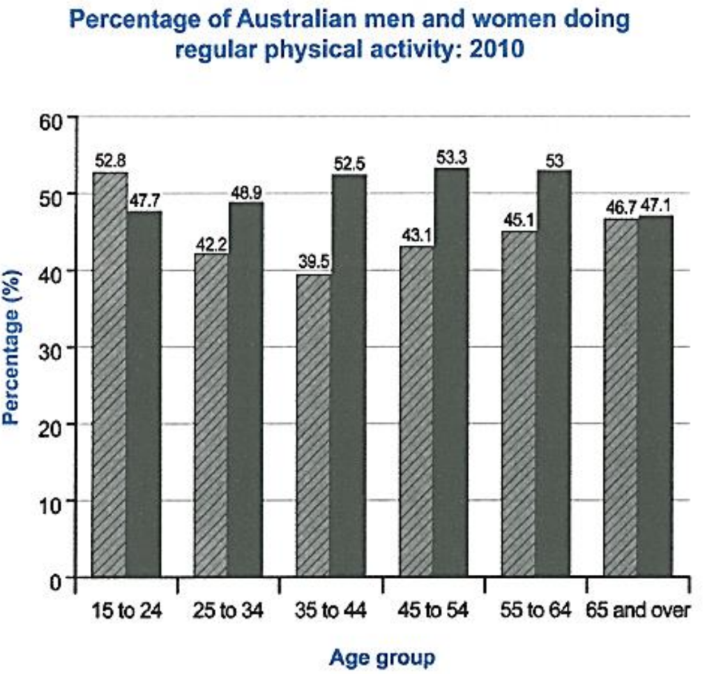
- The bar chart below shows the percentage of Australian men and women in different age groups who did regular physical activity in 2010.
Summarize the information by selecting and reporting the main features, and make comparisons where relevant.
Sample Essay
The bar chart depicts the percentage of Australian men and women across different age groups who engaged in regular physical activity in 2010. Overall, it is evident that women were more active than men across most age groups.
In the youngest age group (15-24 years), 52.8% of women engaged in regular physical activity compared to 47.7% of men. This trend continues in the 25-34 and 35-44 age groups, with a significant gap in the latter, where 52.5% of women were active compared to only 39.5% of men.
Interestingly, in the 45-54 and 55-64 age groups, the gender difference narrows slightly, with 53.3% and 53% of women, respectively, participating in regular physical activity compared to 43.1% and 45.1% of men. In the oldest age group (65 and above), women continue to lead with 47.1% being active, while 46.7% of men engaged in regular physical activity.
In summary, the bar chart reveals that women in Australia were more physically active than men in 2010, particularly in the 35-44 age group.
Feedback:
– Task Achievement: 6
The response effectively summarizes the key trends and comparisons between different age groups and genders.
– Coherence and Cohesion: 7
The essay is well-structured, with clear comparisons and logical progression. However, the use of cohesive devices could be enhanced.
– Lexical Resource: 7
The vocabulary is appropriate and varied. More advanced expressions could be used to achieve higher scores.
– Grammatical Range and Accuracy: 7
The grammar is generally accurate, with a range of sentence structures. Minor errors are present but do not hinder understanding.

